Factory Floor 001 Papercraft & Digital Kits

Launched November 2019

20191209_123310 (1).jpg

Concept

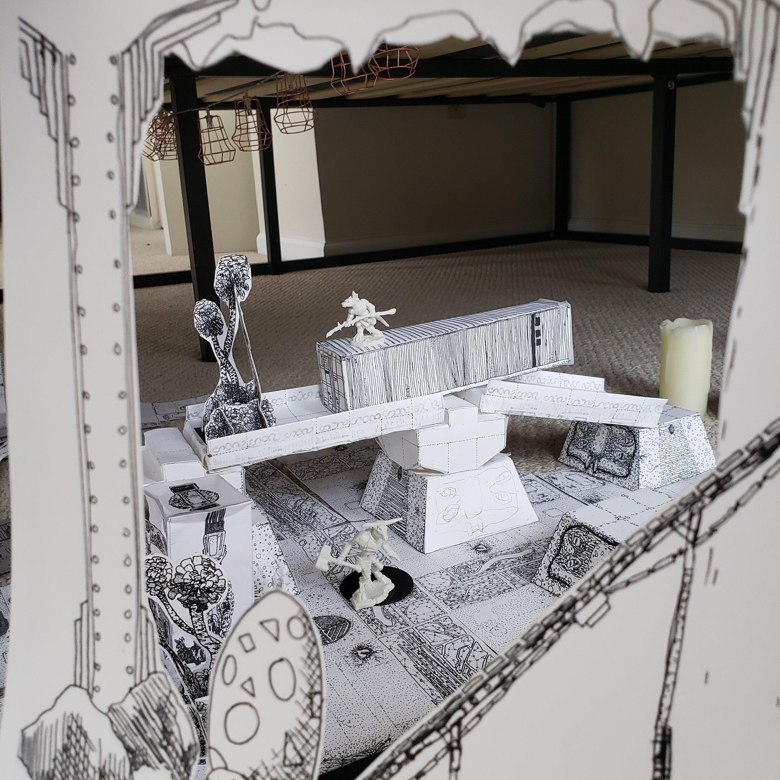
The Factory Floor is a miniature environment, composed of paper worksheets which you cut, tape, and assemble at home.

It is the culmination of two threads in my work over the last few years. From one side comes down cartography and map-making, as seen in the maps for Intimate Subjects, Firewalk, and Dead Man’s Hollow. On the other side stand papercraft models, folded and taped and upright, though built from flat worksheets, such as Baleful Botany and the Cetacean Statue.

The Factory Floor is both cartography and territory - it is a tiny paper world, described by and assembled from flat prints of itself.

I envision it as an archetypal workshop space, a vast underground factory-cavern, in the style of cinematic secret factories, marshalling yards, and warehouses. Think Raiders of the Lost Ark, Independence Day, or Treasure Planet.

Appropriate for Dungeons and Dragons and other fantastical games, the factory is lightly themed with salamander and newt-related imagery, as if built by an ancient race of upright amphibians.

20190724_121218.jpg

Design Goals

This is an art project and a commercial product, and so its design goals are of both an inspired and a commercial, material nature.

A factory floor is determined in some dimensions by the products and materials it is built to handle, and by the industrial standards which its vendors require (loading docks, door widths, rail service, available building materials, etc).

Similarly, the Factory Floor product’s dimensions are determined by our real world standards for printed paper (the medium by which the product is reproduced).

To maximize the product’s salability and commercial viability, printing is black and white, on 8.5 x 11 paper (and potentially A4 paper for European customers).

The paper standard - 60lb white cardstock - is a common weight for covers, sections, and durable worksheets in modern America. It is available as a commodity product, from local vendors, online stores, and many other supply chains. As my art continues, I can fine-tune or localize the paper supply, as I learn more and more about sustainable paper sourcing.

20190805_095616.jpg
20191219_121043.jpg

The final product should be salable in person, online (by mail and as a digital product), and in stores, and so it needs to have appropriate trade dress for each of those outlets.

Additionally, the digital product is its own secondary work - a set of digital blueprints which can be printed on demand at home, rather than a kit with a specific numeric manifest. These digital originals needed to stand on their own, as a product of demonstrable value.

When designing for 8.5x11 home printing,, you must keep the must-have design elements within 7in x 10in. Many printers cannot print edge-to-edge, or will mis-register, skew, or print off the edge if they try. Another limitation, related to the print-at-home potential for these worksheets: the art must be black pen-and-ink only, with very little grey in the final product, and certainly no ink-heavy fields of black.

20191210_101108.jpg

Inspiration // Implementation

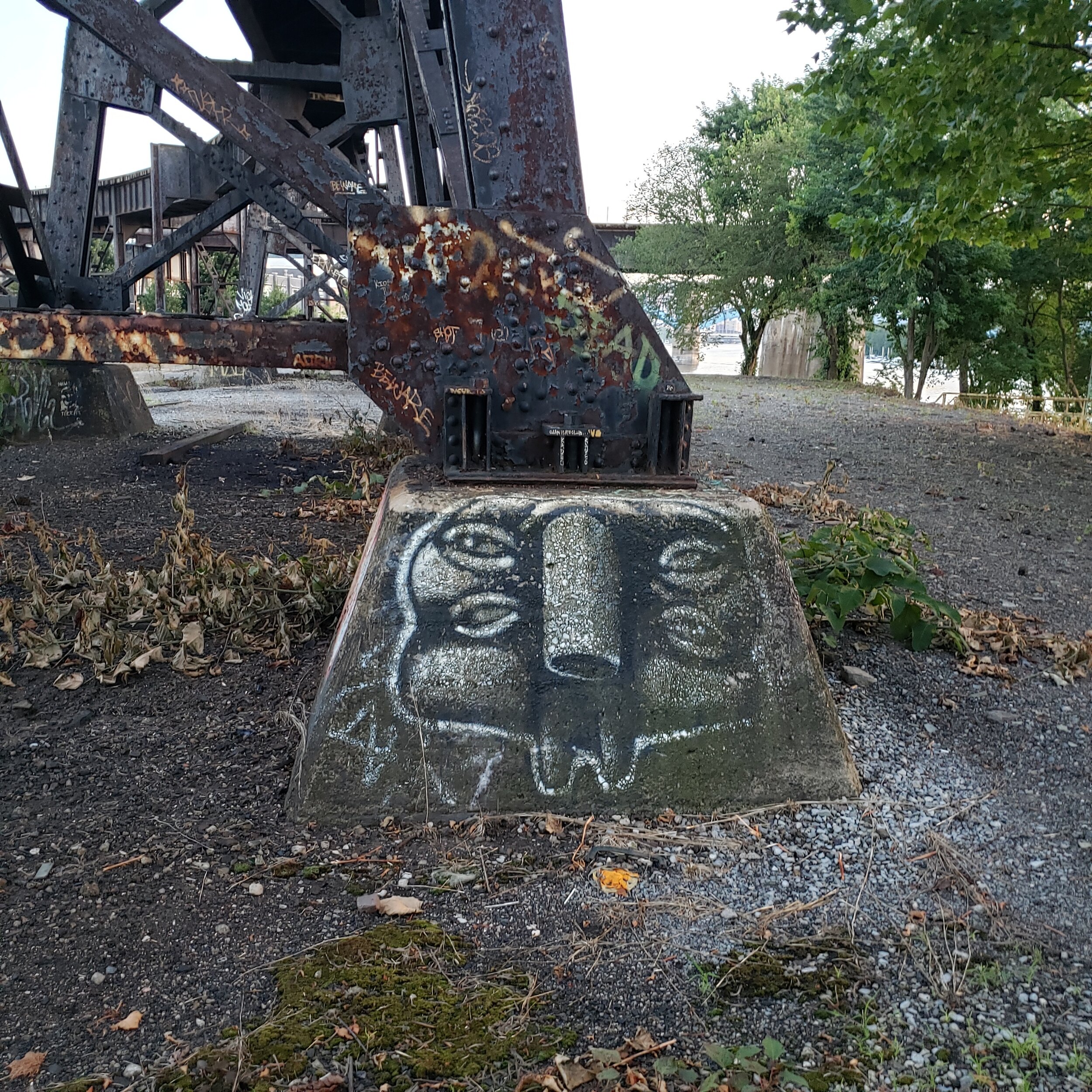
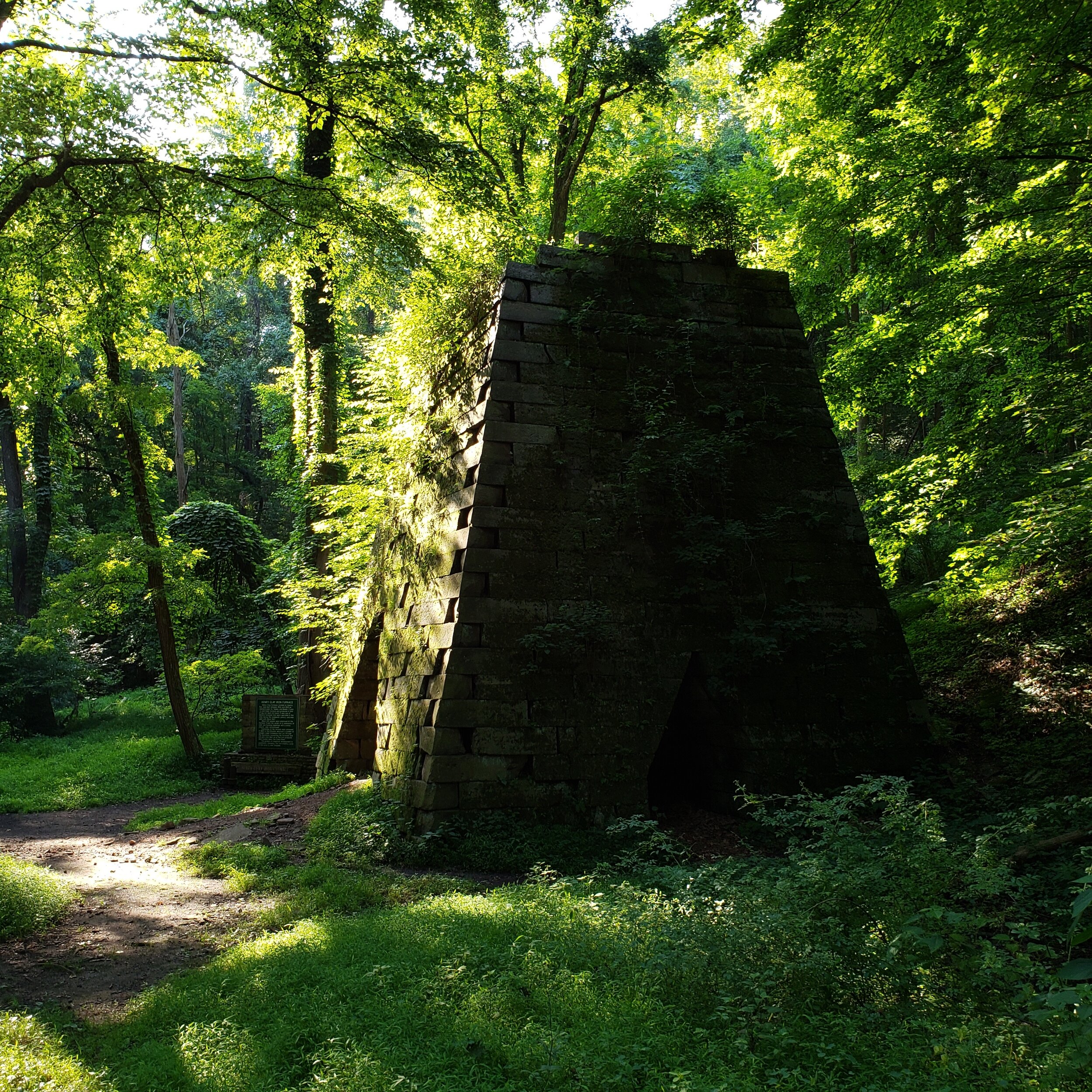
I drew inspiration for the Factory Floor from all around my Pittsburgh environment. Between the warehouses, fabrication buildings, cement plant, welding operations, and wholesalers in the Strip District neighborhood of Pittsburgh, there are thousands of material examples steel, brick, and wood commercial buildings, the product of fifteen decades of industry in these river-valleys. Within 100 miles of Pittsburgh, there are industrial ruins from the 1830s forward, as well as sites of human habitation stretching back 16,000 years. Here are a few inspiratory sights, and the papercraft pieces they produced.

20190718_202834.jpg
20190813_130158.jpg
20190804_132431.jpg
20200106_104025.jpg
20191222_093621.jpg
20190725_175257.jpg
20191209_205731.jpg

You can find the digital Factory Floor for sale here, and order a physical kit (by mail) here.
Firewalk 2019 Map

In October and November of 2019, City of Play put on a public festival in Allegheny Commons Park, with storytellers, musicians, and dancers bringing community and warmth to the park, hosting three cauldron-held fires, as well as a central, firelit market.

This evening celebration needed a map of the extensive park and its pathways, to help folks navigate the long distances between the flames. These map/schedules were given out as 11x17 scrolls, with the map forming the center core, as it had the most important information - location!

firewalk map_V4 CSB Working doc.png

In addition to this map, I also launched the Factory Floor Papercraft at the central market of that November event.

Intimate Subjects III Map

September 2019

CMOA x SLOWDANGER x CITY OF PLAY

Tonight, the Carnegie Museum of Art keeps the lights low. Intimate Subjects is a Third Thursday 21+ event at the Museum, an interactive evening of performance, dance, games, ritual, and music, all designed around cultivating close-feelings between p…

Tonight, the Carnegie Museum of Art keeps the lights low. Intimate Subjects is a Third Thursday 21+ event at the Museum, an interactive evening of performance, dance, games, ritual, and music, all designed around cultivating close-feelings between people. This is the third Intimate Subjects, and the second for which I have made a map / schedule. Attendees will receive a parchment print of the map, a gift and guide for the evening. I'm really pleased with how it came out. Intimate Subjects is tonight, from 8pm to 11pm. $10

In the late summer of 2019, the Carnegie Museum of Art hosted its final Third Thursday evening event. Across the first floor of the museum, performers from across the globe and across the city lit the museum up with dance, music, sculptural performance, interactive games, and live theatre. In addition to hosting an instance of A Feeling in the City, I also designed the map & schedule for the evening. Each attendee got a printed copy to keep. In this way, the map served as both a guide to the evening, and a retrospective of the performances held during it.

In essence, I sought to capture the visual impression of the event before it had taken place. It is a neat trick, and only possible thanks to the wonderful event logistics management which the whole team performed. With a schedule locked down well before the event, I had a whole week to draw this map.

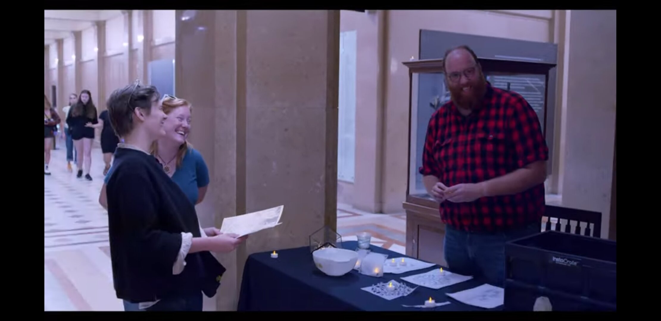
Here are some of my thoughts from just after the event:

Screenshot_20190924-133650_YouTube (1).jpg

What a night!

This was the third Intimate Subjects event, an ongoing collaboration between the Carnegie Museum of Art, the dance troupe slowdanger, and City of Play. Intimate Subjects is just one of the many series and single-night Third Thursday events at the Carnegie Museum of Art - monthly evening socials, 21+, with a cash bar, and usually a dance floor somewhere in the halls. Intimate Subjects in particular began as a conversation about emotional connection to art - can evening guests be invited to draw deeply personal meanings from the collection and the space? What happens if they do?

I participated in the meaning-making-evening in two ways. 

  • First, the light-and-inspiration ritual pictured above, A Feeling In the City. Every guest got their own genuine, museum-grade inspiratory light, to keep, and options for further engagement and instantiation of that fiery process. You can download and print your own lamps here.

  • Second, I illustrated the map and schedule for the evening, seen at the top of the post.

The map was printed on yellow-white cardstock/parchment, highly textured, giving depth & character to the single-tone spaces. Though similar to last year's Intimate Subjects map, which I also illustrated, this second try is significantly cleaner and clearer. Last year's map had much too much floor texture. This year's map is much more legible, and legibility is a prime requirement of useful cartography.

Making these maps is an intense process - because its imagery is drawn from both the artist's performances and the museum spaces they are performing in, I can't start drawing anything until the final schedule, artist list, and space list for the evening is set in stone. I made sure to keep my calendar open for the 10-14 days leading up to the event, but even so, the work spilled over the bounds of its appointed hours - hence the slip in the newsletter schedule these last two weeks. Now I know to pad my drawing time estimates another 10%!

I had a lot of fun conveying the essential character of each of the spaces we activated in the museum, as well learning about each fellow performer and including figures, scenarios, and poses from their past work.

Some detail shots and making-notes:

Screen Shot 2019-09-25 at 11.50.16 AM.png

The figure layout for the Resonant Bodies room was inspired by a governmental illustration of the Slotin Criticality Accident, ringed by the circular bases of the green columns in that room, the Hall of Music Foyer. 

The Lost Crate was displayed in the rarely-used Music Hall Entrance, perhaps the most ornamented room in the building, and an appropriate place for a fellow robber baron's lost treasures to be displayed. The Music Hall Entrance is perhaps most famously depicted in the 1983 movie Flashdance, as the ballet school's imposing front doors.

Screen Shot 2019-09-25 at 11.51.01 AM.png

The Music Hall itself I stripped down to the stage and pipe organ, redecorated to be a futuristic and sacred celebration space. The pipe organ was first constructed by the firm Farrand & Votey, in 1895. It has had three significant rebuilds since then, extensive enough that each incarnation was its own unique instrument. You can delve into the technical history over at the Organ Historical Society's Pipe Organ Database.
From its construction in 1895 until 1981, the Carnegie Institute retained a Municipal Organist, often the institute's director, who played a biweekly recital series, for free, for the public. They reached their 1000th recital in 1909. By the time the series closed, they had hosted more than 4700 such free performances. The organ was last played in 2010, during the Organ Historical Society's national convention

The pipe organ I drew above would thus be a fourth rebuild, done some time between now and 5981 AD, adding spires, towers, monumental faces of powerful futurist musicians, and an angel.

As Robert J. Gangewere notes in his 2011 book Palace of Culture: Andrew Carnegie's Museums and Library in Pittsburgh, "such a restoration [of the organ]- and the further renovation of Carnegie Music Hall itself - awaits major funding, board advocacy, and grassroots support."

Screen Shot 2019-09-25 at 11.51.38 AM.png

The Hall of Sculpture hosted Empathy Machine, a circular light installation, and a series of scheduled performances. The dancing figures are representational of previous performances. The moray eel and moorish idol fish have escaped from the Museum of Natural History, the closed, adjacent space, visible here as the bones of an irish elk, a saber-cat, and a dorudon.

The Hall of Architecture shows off two church-facades, some of the largest architectural replicas in the world; and the space's activities. the game of Small Precious Objects, and an interdimensional Marketplace.

Screen Shot 2019-09-25 at 11.52.08 AM.png

These interstitial spaces at the far end of the map were compelling to draw, because they devolved into abstraction and landscape, suggesting no real end to the layout, no boundary between the museum and the city. 

---

For many of the guests at Thursday's event, this was their first or second time in the museum - brand new students starting their fall semester at one institution or another. I think we did a great job, the Museum, slowdanger, and City of Play, at welcoming and delighting these new neighbors.

Thanks to everyone on this list who came out to the event - What a night! What a feeling!

Many thanks to Laura Zorch McDermit for her tireless efforts to better the Museum and the City.

Warm regards as always to Greg & City of Play, and much love to slowdanger.

Alex, this one’s for you.

You can hear the sound

Of the underground trains

A Feeling In the City

Performers at Play

Summer Residency at Carnegie Museum of Art

Summer 2019

Carnegie Museum of Art x slowdanger x City of Play

Providing inspiration at the Intimate Subjects evening event.

Providing inspiration at the Intimate Subjects evening event.

Summer of 2019, I was in residence at the Carnegie Museum of Art, letting their collection and active exhibits inspire me and guide the art I make. The residency was called Performers at Play - it was the first movement, theatre, and ceremony residency the museum had hosted in many years. It was healthy boundary-pushing for the organization, because human motion and frivolity is at such odds with the priceless, no-touch nature of so many of the objects there. 

Over the course of the residency, I designed "A Feeling in the City", a social ceremony that occured at the Carnegie Museum of Art. It was an interactive event, and a meaningful one, somewhere between arts-and-crafts and meditation. It ran three times - twice during regular museum hours, and once during the Intimate Subjects event night.

A Feeling In the City is empathy practice, in spaces that exhort it. The art considers a wide spectrum of human sense-making. The contemporary exhibits at the museum traced designed experience, from shared social spaces in cities, to some of the most personal and close objects we each use. 

The first round of "A Feeling In The City" paper lanterns, inspired by the views in the Pittsburgh Anthology room at the Carnegie Museum of Art. The lanterns are physical gifts created by the A Feeling In the City process. From left to right, a copp…

The first round of "A Feeling In The City" paper lanterns, inspired by the views in the Pittsburgh Anthology room at the Carnegie Museum of Art. The lanterns are physical gifts created by the A Feeling In the City process. From left to right, a copper lantern, a mill scene, five doors within the museum, and a rowhouse captured in the Charles "Teenie" Harris archive. FIre safety advocates worry not: the flames are LED tealights.

Here’s some of my thinking in September, as the Residency was winding down, and the final events were nearing.

My residency at the Carnegie Museum of Art has been a productive one! The few weeks of August flew by. I've been diving into the artistic history of the city, within the Museum's wall and across the city itself, centering my work around the Museum's current exhibits. The theme which has wedded this work together has been the linguistic connections between breathing, light (especially candle-flame), and new thought. Beautiful ideas live on. If you nourish one, it will grow, and you will be nourished by it in turn. Museums like CMOA are important repositories for the sublime objects we've inherited. The ways of seeing the world which the museum's collection engenders are rare and valuable technologies of thought. I hope that "A Feeling In the City" helps visitors bring those ways of seeing home with them. I want the inspiration to stick.

Operations Manual

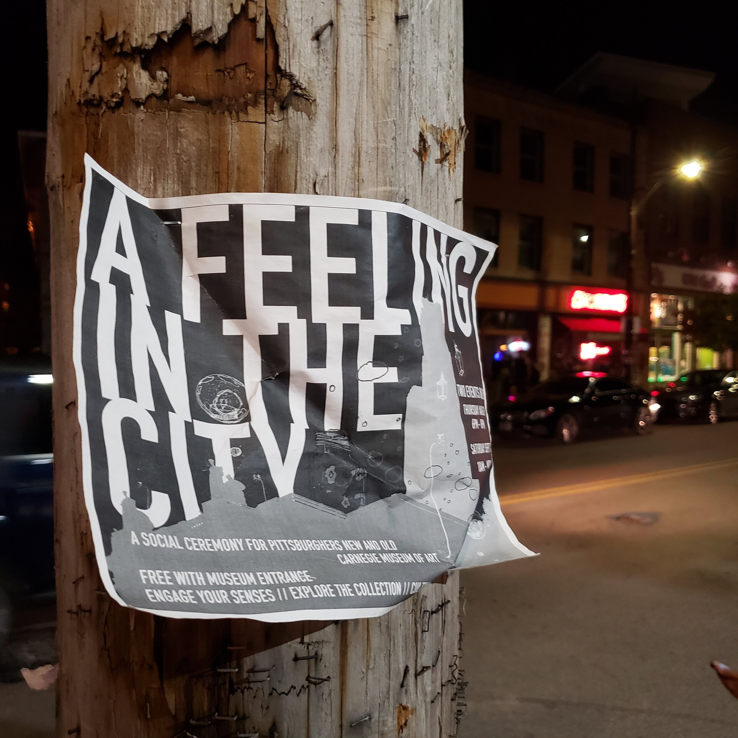
One of the flyers for A Feeling In the City stayed up for many weeks on a phone pole in Lawrenceville, much to my delight.

One of the flyers for A Feeling In the City stayed up for many weeks on a phone pole in Lawrenceville, much to my delight.

My summer residency at the Carnegie Museum of Art was a wonderful experience, and, excellently, a paying gig. The product of that residency, A Feeling In the City, is a very small & local lantern festival, best expressed by being re-enacted: at the Carnegie Museum of Art, other civic institutions, in neighborhoods, classroomes, homes.

A Feeling In the City is a papercraft-and-LED crafting ritual, designed to formalize and document inspiration one encounters at a cultural institution. It can be used as an educational tool, a public encounter, a welcoming-table for a larger event, and more.

I've put the whole project together into a Project Report and Operations Manual, found hereI'm releasing the whole thing into the public domain, today, forever. I've already been appropriately remunerated for this work - its best and highest use now is to be given away as easily and directly as possibly. From Appendix IV: Licencing Structure:

Pursuant to Andrew Carnegie’s “Free to the People” vision for his institute, and the artist’s own wishes, this project report, operations manual, and digital art are hereby released into the public domain, to be used and reused as the institution, the artist, and the public see fit. 

As of October 1, 2019, A Feeling In the City has 

No Copyright.

You'll find all seven lantern templates from the summer residency, information on how to re-enact the lantern-making interaction, vendor info, and more.

Assembling lanterns in the gallery halls of the museum.

Assembling lanterns in the gallery halls of the museum.

Cetacean Statue - Pittsburgh Papercraft - May 2019

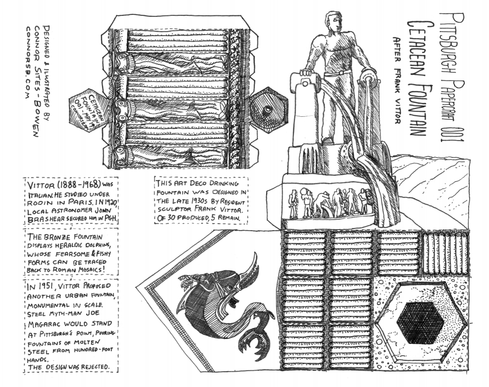
[The papercraft fountain, surrounded on the left and rear by its artistic inspiration, and the sculptor's planned monumental Joe Magarac fountain.]

[The papercraft fountain, surrounded on the left and rear by its artistic inspiration, and the sculptor's planned monumental Joe Magarac fountain.]

My aim with this papercraft project was to produce an educational item about a piece of Pittsburgh’s past, suitable for sale at a museum shop or local-interest bookstore as a flat kit, which the user would cut and assemble at home.

Some specific design goals I had when I started:

  • Kit should be no more than two pages, and print on a standard laser printer (Single-sided US Letter).

  • Kit when assembled to its maximum should be a sort of miniature museum display, recreating the knowledge the museum houses on your shelf at home.

  • Final objects should be 1” grid-compatible, so that they can be reused for tabletop gaming as well.

I dove into Pittsburgh's built environment, looking for details, objects, and buildings which might be handsomely rendered in paper form.

The Historical Fountain

20190423_112552.jpg

The object that I was drawn to was a drinking fountain, a beautiful bronze fountain in Highland Park, with strange fishlike creatures swirling down its watery art-deco sides.

Here’s how I described the fountain in my newsletter:

My first Pittsburgh Papercraft subject is a rare one - one of the five art deco drinking fountains to be found in the city's public parks. The most prominent one is at Highland Park, just to the left of the grand entrance. The fountains were crafted by Italian-born sculptor Frank Vittor, who moved to Pittsburgh when he became friends with local astronomer John Brashear. They depict fearsome heraldic dolphins, modeled on Roman artistic renderings of the fishlike mammals.

Mr. Vittor went on the have a long career of public art in Pittsburgh, from sculptures to relief murals to park infrastructure.

In the 1930s, resident sculptor Frank Vittor designed this art deco drinking fountain for installation across Pittsburgh’s urban parks. Thirty fountains were cast, of which five remain.

The fountains provided water to passers-by, and are each guarded by heraldic dolphins. The scaly, toothsome design of these dolphins can be traced back to Roman mosaics of the cetaceans as heralds and steeds of Eros (later called Cupid), the god of Love.

Vittor, who was born in Italy and trained as a sculptor and artist under Rodin in Paris, moved to Pittsburgh in 1920, after a 1917 visit where he met long term friend and local astronomer John Brashear. His works can be seen across the city, from the Boulevard of the Allies to the Westinghouse Bridge.

In 1951, he proposed a monumental sculpture at the Point - a hundred foot tall statue of the mythical steel-worker Joe Magarac. The larger-than-life worker would pour back-lit water (‘molten steel’) from full-sized ladles held in his bare hands, melding together and mimicking the confluence of the rivers.

The sculpture proposal was declined. Vittor continued to produce sculpture until his death in 1968.

Designing the Papercraft

First design decision: the scale of the various objects in the scene.

The snap-to-grid design requirement limited the fountain object’s diameter to either 1” or 2”. Tracing out the triangles within a hexagon within a square, I found that each hex-side must be .5” or 1” wide, respectively. From that math, it was clear that a six sided object at the larger scale would take up most of a page all by itself, while the smaller scale one would leave plenty of room for an entire containing environment in an L-shape around it. This economy of page-use appealed to me, and a fast mockup of the shapes felt good to hold and construct, so I went with the smaller scale: .5” sides, a 1” diameter, and a 3” final height for the fountain.

20190506_171244.jpg

Second design decision: layout.

The L-shape left by the fountain can be folded upwards to create three faces of a rectangular prism, a corner of printed information, art, and diagrams, to give the dolphin fountain greater context.

(The displayed context information: the history of dolphin depiction in mythical art, and the sculptor’s later project proposal of a monumental civic statue of a steelworker’s heroically strong form. The former is a more universal topic in art - you find dolphins represented in art across thirty centuries, or more. The latter is a deep dive into alternate Pittsburgh histories - landmarks that never were, but were, at one time, proposed!)

The fountain’s top and bottom make its flattened form taller than it is wide, so the L shape has a corresponding composition to its two legs - one is much taller than the other. I used this taller side to depict the monumental sculpture, and the shorter one for the historical mosaic.

(please do not piratically download and print this low rez version. There is a paper kit available for sale here.)

(please do not piratically download and print this low rez version. There is a paper kit available for sale here.)

Research Notes & Further Reading

If you’d like to learn more about the confluence of ideas these cetacean statues embody, here follows a few good places to start reading:


From 2008, this Post-Gazette article on the occasion of a historical sign dedication near the Columbus statue Vittor sculpted, near the Phipps Conservatory and Flagstaff Hill. The article goes into detail about many aspects of Vittor’s life. Some of the strangest details concern his arrival in Pittsburgh, precipitated in part by the famed beauty of young Evelyn Nesbit and the so-called “Crime of the Century”.

Many immigrants to the United States furnished labor for booming steel mills and coal mines. But Mr. Vittor was born into a family of artists in Mazzate, Como, a suburb of Milan, and began sculpting at the age of 9 when he made a wood carving in bas-relief of the poet Dante.

He was educated at the Brera Academy in Milan, then studied with Auguste Rodin in Paris. He came to America in 1906 as a protege of Stanford White, the famed New York architect.

But by the time Mr. Vittor arrived in New York, Stanford White had been shot dead by the jealous [over Ms. Nesbit] Harry K. Thaw in Madison Square Garden.

Despite his lack of money and knowledge of English, Mr. Vittor set up a New York studio. He later left Manhattan at the urging of the noted astronomer Dr. John A. Brashear, who saw five of Mr. Vittor's bronzes at a Pittsburgh gallery. Love played its part, too -- in 1917 he met and married a Pittsburgh woman named Adda Mae Humphreys and eventually set up a studio at 2565 Fifth Ave. in Oakland.

(Marker to honor 'sculptor of presidents' Frank Vittor Marylynne Pitz, Pittsburgh Post Gazette October 12, 2008.)


In January of 2016, Pittsburgh Magazine’s PittGirl explored a long history of proposals for the Point, none of which were built. She was able to find an old (but unnamed) Post-Gazette article, with the following description of the statue as completed:

Each arm of the massive figure would rest on upturned steel ladles, which, in turn, would pour simulated streams of molten steel into a third ladle. That typifies the joining of the Allegheny and Monongahela Rivers to form the Ohio.

Around the base of the statue, Vittor proposes that 40 10-to-12 foot figures be carved to show how production of steel in Pittsburgh affects the cultural, social and business life of the city.

On the outer rim of the statue, Vittor has designed a system of water fountains. They would draw water from both the Mon and Allegheny and project it into 50 to 100-foot streams around the statue.

The whole monument would be lighted at night, giving color to the water. The molten metal streams would glow, day and night.

Beneath the statue, Vittor has designed a room, at least 100 by 70 feet, to serve as a museum, aquarium, or industrial display space.


A short entry in the Father Pitt blog, with a few photos of the statues in 2009.


The Western Pennsylvania Numismatic Society has a thorough history of Mr. Vittor’s coin-work (the Gettysburg Half-Dollar) as well as many of his public statuary.


In 2012, the Post Gazette recorded an effort to cast more fountains, using the original molds, but after the City Council allocation approval, there isn’t much in the papers about how the project went.

First Found Puzzle Box - April 2019

20190420_212810 (1).jpg

On April 20, 2019, the Lost Crate of HP Witherspoon was displayed to the public during Heathside Cottage’s Spring Festival. To commemorate the event, I was commissioned to create a paper puzzle box, a small parallel to the museum crate which was on display.

The Lost Crate is itself a puzzle box of clever design and many layers, and this paper box mirrors those qualities.

The box puzzle I crafted has more than twenty sides, but a folded box only shows six. As you fold and re-fold the puzzle, different exteriors remain. Three of those configurations are “solutions” - they have matching thematic sides, and if lined up correctly, the “lid” can be lifted to reveal a hidden message about the Lost Crate.

Dead Man's Hollow Treasure Map - March 2019


20190327_110432 (1).jpg

On the Spring Equinox, 2019, the public, armed with maps of my manufacture, found two buried treasures in Dead Man’s Hollow.

A forty foot snake, a quarry, a few murders and shootouts, a brick manufactury, buried treasure, a clay pipe factory, a deadly fire.

Dead Man’s Hollow, a few miles upriver from Pittsburgh & Mckeesport, has seen seven generations of strange happenings.

Rumor is, the place is haunted by a half dozen ghosts. It’s told that a crazed old billionaire, HP Witherspoon, had his treasures buried there in the late 20th century. Local lore is that the bluff above the old boiler building played host to satanic, wiccan, and anarchist teen-meetings from the Led Zepplin era through to No Doubt.

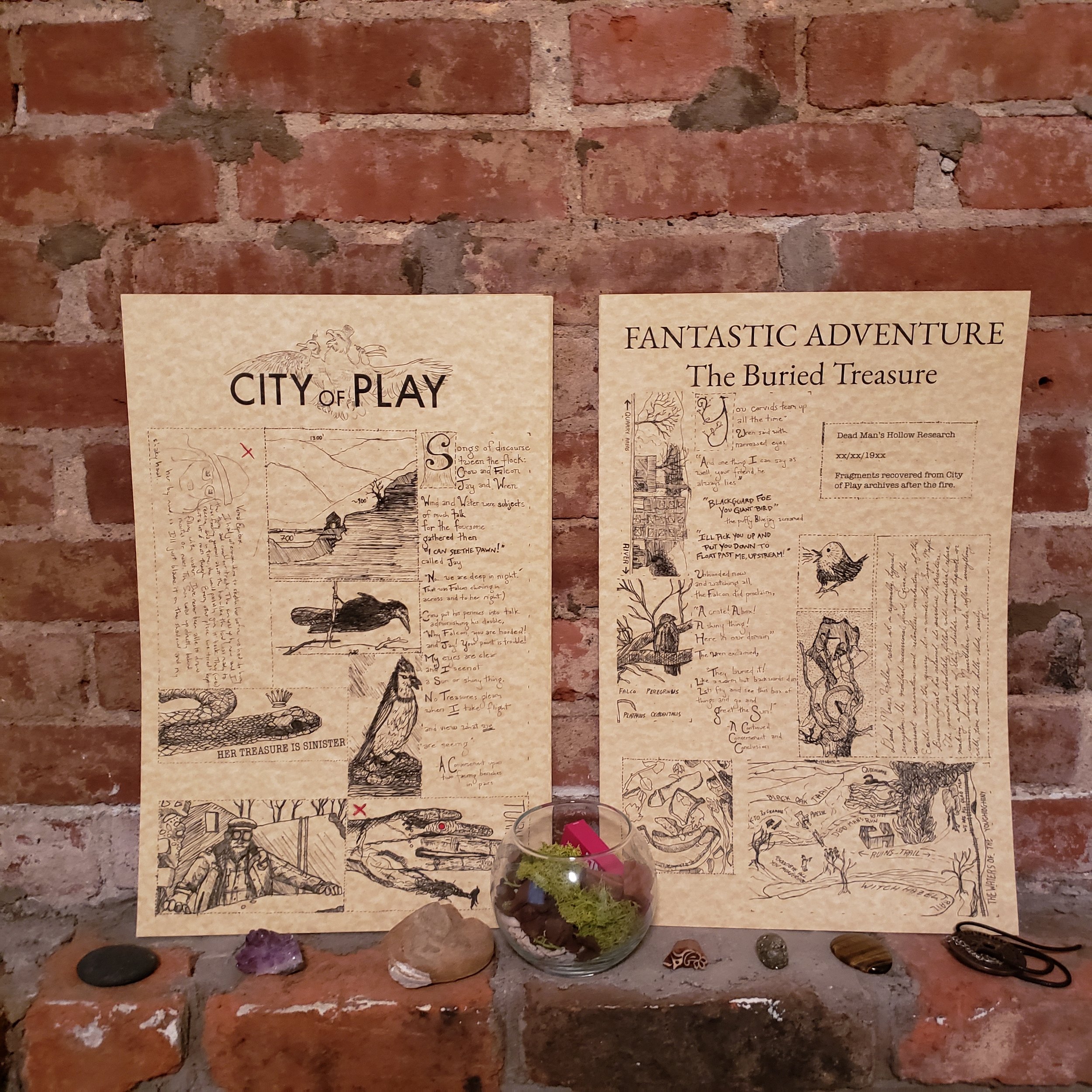
In 2019, this treasure map was produced from the research fragments City of Play was able to recover from the burned archive where they had stockpiled that knowledge. The archivist left town years ago. We have shored these fragments against our ruin, and they are presented here, in a limited run of 50 treasure maps, from which we have just 15 left.

Two treasures - the box buried by HP Witherspoon’s crew, as well as the blade of a snake, were recovered using this very map, in March of 2019. Its poetry, illustrations, site diagrams, local lore, and curious symbology led the public right to these secreted objects!

Who knows what other treasures it may reveal, in the hollow of Dead Men…

Perhaps you yourself could possess this knowledge, this map.

Dead Man’s Hollow is a public open space about fifteen miles south of Pittsburgh, just off the Youghiogheny River (“The Yough”, pronounced like ‘rock’), which itself is a major tributary of the Monongahela river. The hollow was once a clay quarry, then a brick manufacturing company, and then the Union Sewer Company, which manufactured large clay pipes for storm and sewer drainage systems.

The Hollow is managed by the Allegheny Land Trust, a non-profit which stewards dozens of open spaces in Allegheny County. City of Play and the Trust worked together to figure out the logistics of the treasure hunt. The trust provided me with notes, archival materials, and reports about the Hollow, its history, and its lore.

I’ve done my own exploration of the area in years past, and during the planning process, I visited the site two or three more times. Once we had located a site for treasure excavation, we spread out and looked for clues in the landscape, which might direct the public towards the treasure.

The map I created represents, in the snippets of text and image it presents, a synthesis of these clues: the history and myth of the land, information about the flora and fauna of the Hollow, and the details of HP Witherspoon’s interaction with the Hollow.

Its success is in its use - the map worked! After a few hours of puzzling and digging, members of the public located the treasure, and subsequently unburied it!

Baleful Botany 001 - February >> April 2019

Baleful Botany 001 - Aeonium Arboreum began on the Batteries to Bluffs trail in San Francisco, California. I hiked there in January 2019.

The trail is the westernmost in the Presidio, a former military fort, with hundreds of years of battlements, gun emplacements, and other harbor defence infrastructure. Once federal military land, It is now part of the Golden Gate National Recreation Area. It is thus managed by the National Park Service, not the City of San Francisco.

Battery Chamberlin, on Baker Beach, San Francisco, CA.

Battery Chamberlin, on Baker Beach, San Francisco, CA.

That trail winds upwards from beachside gun batteries on Baker Beach, an-ocean-facing beach a mile south of the Golden Gate Bridge. The trail climbs across a series of landslide-prone hillslopes, many of which feature deposits of serpentine, a greenish-blue rock of slippery and greasy feel. It is there and in nearby neighborhoods that one can find stands of the succulent plant Aeonium Arboreum, the ‘Irish Rose’.

The original reference photo. January 2019.

The original reference photo. January 2019.

My goal was to recreate elements of that walk on paper, as a simplified &cartesian model of the landscapes I encountered. Standing in three dimensions over that map: the unique flora and fauna that flourish in it, starting with this Irish Rose.

My first sketches, soon after the initiating trail-walk. Thanks, Cam, for confirming the plant identification.

My first sketches, soon after the initiating trail-walk. Thanks, Cam, for confirming the plant identification.

I outlined the layout in my journal the next day, and created a physical prototype a few weeks later. I got very lucky with the initial physical drawing - I moved quickly from pencil sketch to pen to scanned art layer to printed prototype, with little rework. Most of my time was spent on the digital side, lining pixels up and creating graphical cut-marks and trim-areas.

A few interlinked stands, atop a prototype map of the Forest of Woe, an infernal encounter space from Geoffrey Grabowski’s Dreams of Ruin book.

A few interlinked stands, atop a prototype map of the Forest of Woe, an infernal encounter space from Geoffrey Grabowski’s Dreams of Ruin book.

The penwork is all Micron Plastic Nib pens, in black. I worked in layers, moving from half-inch dot grid paper to blank tile templates, flipping back and forth between physical drawing and digital composition.

I built out seven different versions of the worksheet, each one from a different world. I called these ‘flavors’, a bit like an ice cream shop - one kind of product (ice cream) , with many different flavor options to choose from (chocolate, vanilla, cherry, etc.).

The idea was to reuse the folding plant artwork, with a few different bases, and surround it with unique and very different commentary, secondary illustration, creature tiles, botanical tags, and other ephemera.

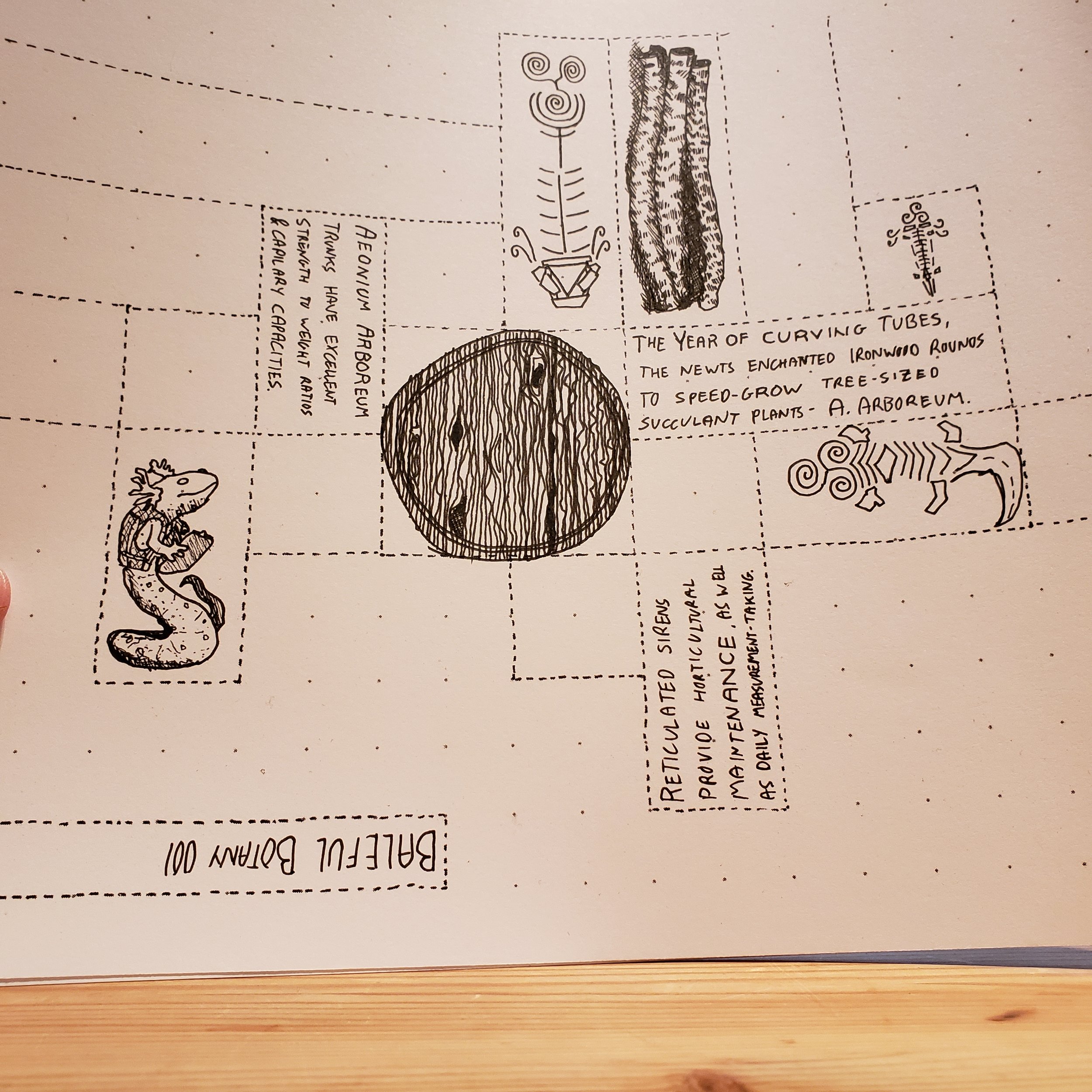
The Newt Industry flavor features reticulated siren engineers monitoring the magical industrial farming of aeonium arboreum specimens, in service of their annual and ever-changing festival calendar, the Liturgical Industrial Egg Ritual. Here, I drew…

The Newt Industry flavor features reticulated siren engineers monitoring the magical industrial farming of aeonium arboreum specimens, in service of their annual and ever-changing festival calendar, the Liturgical Industrial Egg Ritual. Here, I drew the secondary art and text separate from the plants themselves. I combined them digitally to create the final worksheets.

Each ‘flavor’ provided a different design constraint, and pushed me to work in a different direction.

  • Rampant Exofauna and Baleful Botany were the original two ideas - fantastical and science-fiction-appropriate terrain for tabletop roleplaying games, like Dungeons and Dragons, Gamma World, or Warhammer 40000. On a 1in:5ft grid, the plants are 20ft tall, twice the height of most adventurers, or space pirates. It was this use, as the highly visible centerpiece of a gaming table, which demanded the fold-and-seal format of the art: these plants must be viewable from all sides, with well-registered art.

  • I designed The Irish Rose of San Francisco for museum gift shops, park offices, school field trips, and other educational-and-fun needs. This version presents a variety of science and history facts about the species, suitable to encourage the intellectually curious to delve deeper into the field.

  • For our #instagram era, Paper Ritual combines #succulants, #papercraft, and #selfcare into one powerful worksheet.

  • A spiritual exploration, Jesus Loves an Irish Rose links the plant to the triskelion and the trinity.

  • A gothic, neo-victorian take, Dr Ward’s Vivarium presents the Irish Rose as a strange specimen gone wild with growth. Wardian Cases, briefcase-sized greenhouses for individual plant specimens, were an early form of terrarium.

  • Finally, Newt Industry presents the plants as part of a fantastical industrial ritual, with amphibian supervisors keeping careful track of magical growth rate.

Each flavor acted as another draft or test, and creating so many flavors honed the shared layout across all seven of them.

Draft of The Irish Rose of San Francisco

Draft of The Irish Rose of San Francisco

Draft of Paper Ritual

Draft of Paper Ritual

The grey guide marks were one of the many breakthroughs the iterative process allowed me to find. By cutting to the rectangular outline of each piece, then adhering the two sides, then trimming both sides of grey away, the end user keeps the art on each side correctly registered (lined up with its mirror), speeds up the assembly process, and gives additional visual assurance of correct cutting. Expect to see this method employed in future paper products.

To display the Irish Rose, I also created a paper greenhouse nook, based on Pittsburgh’s Phipps Conservatory.

Glass and Steel

Glass and Steel

Paper

Paper

Baleful Botany 001 - Aeonium Arboreum is available as a digital product you print at home, and as a physical product I send you in the mail.

I’m excited to explore modeling other plant species in paper. Expect more Baleful Botany in the future, especially if this one sells well!

Bay Area Walking Trails

This post contains a few write ups of walking paths around the Bay Area, with a special emphasis on flat and well-maintained trails. Enjoy!

Right now, this is a work in progress, but I wanted to get the seed of the thing up. I’ll announce it more formally when I’m satisfied I’ve added enough paths.

Stanford Dish Trails

Privately owned open space at the western edge of Stanford’s Campus.

Max Elevation, at the Dish, is ~500 ft (above sea level).

The terrain is rolling hills with grass, live oak, and other drought-tolerant tree-stands.

The trails are mostly paved trails. The few non-paved trails are graveled.

Parking lot trailheads are at Stanford & Junipero Serra, and at Alpine Road. Parking Lot elevations are around 200 ft (asl).

Junipero Serra lot has direct access to “the loop trail” up to the dish and back down, up and down a few sets of hills. This trail has a variety of shelter and shade.

Alpine Road starts in a Eucalyptus grove by a creek, and brings you steadily uphill to the dish, across many open cow pastures, with very little shelter or shade after the Eucalyptus grove.

Pearson-Arastradero Preserve

20190308_102655.jpg

A rolling set of shallow creek valleys, gradually giving way to the slope of the Coastal Range. From the parking lot on Arastradero Road, the first mile on any of the trails is flat. As you leave the concentrated watershed of the creek, the trails get steeper, the vegetation gets more scarce, and the difficulty increases.

This is a good place to do ever-growing loops, where you get a little bit further up the hill each day. As you climb the hill, the two main trails up form a ladder, with trails criss-crossing between them, so it is easy to “create your own” loop.

Edgewood Park & Nature Preserve

Edgewood Park Heights


Edgewood Park is similar to the Stanford Dish, but with an additional level of challenge. It is still foothill and former agricultural land, but there are areas of chaparral at higher altitudes. Water is a must on these trails. Wear real walking shoes - the trails are dirt or gravel.

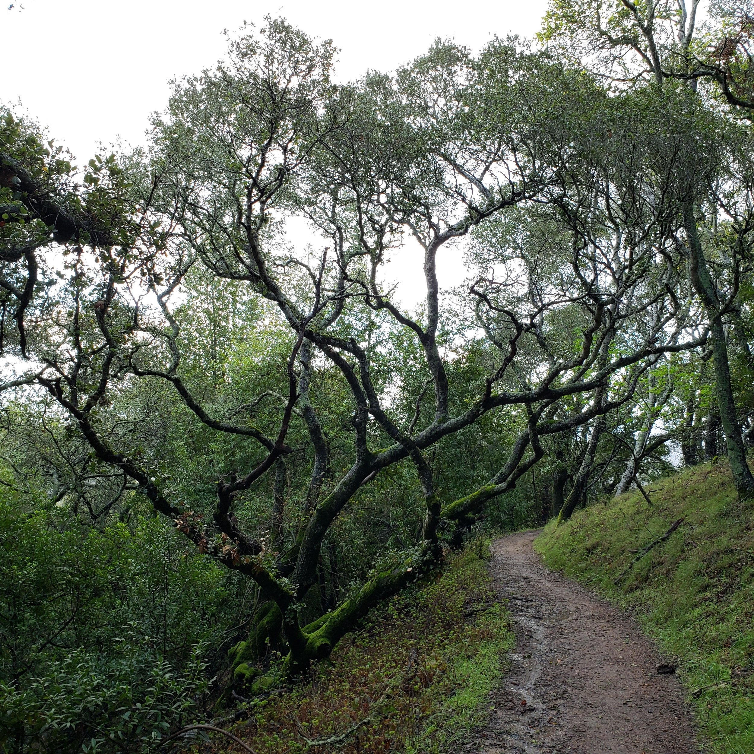
This is a great trail on the first foggy day after a series of dry days - the cooling mist, without the muddy trails.

I enjoy the Sylvan Trail - it is the most gentle of and least switch-back-y of them. Parking for that trailhead is off of Old Stage Coach Road.

There is a secondary entrance on Cañada Road, right before it ducks under the freeway, called the Clarkia Trail. It’s a great morning trail, before it gets too much sun.

Canada

The Crystal Springs Regional Trail

This trail runs for 15-17 miles along the reservoirs and the fault. It passes through a fascinating geological zone, containing inclusions of radically tumbled land (layers are vertical, upside down, etc), the green-greasy serpentine rock, and other fault-miracles. These trails are often flat, especially around the reservoirs.
The dam has a plaque honoring the man who architected the project and saw it completed, Hermann Schussler. The inscription reads “IF YOU SEEK HIS MONUMENT, LOOK ABOUT YOU.”

Suggested Trailheads:

Skyline Blvd & Crystal Springs Road. Walk north along the lake edge, or south to the dam. The trail is paved or packed gravel.

Huddart Park

huddart park walking trails

As one of the San Mateo County parks, it has an entrance fee for parking. My favorite trails all start near one location - the Zwierlein Picnic Area. From there, the Crystal Springs trail wends gently around the deep hollows of the hillside, bringing you down to the creek over the course of a half mile. The Dean Trail, and others, will lead you back up.

The redwoods are a moisture-wicking environment, so be sure to bring and drink plenty of water.

Bair Island State Marine Park

Bair Island

Bair Island, the swampy semi-natural wetland area of restored bayshore, near Downtown Redwood City, is a windy, flat, beautiful walk. Bring a bird guide - you will see all sorts of birds, especially if the weather pattern or wind direction changes. The same swamps serve many different polities of poultry, and incubate conspiracies most fowl.

Trail Map pdf.


Extra Resources


Intimate Subjects - Map & Schedule

August 16, 2018
Carnegie Museum of Art

For this evening of performances and play, I designed, illustrated, and typeset an intricate map-poster, as well as its obverse - a detailed text schedule of the details of the evening's performances.

Full Poster
Intimate Subjects Poster Penwork tuesday final-1~3.png
Intimate Subjects Poster Penwork tuesday final-1~4.png
Intimate Subjects Poster Penwork tuesday final-1~5.png
Intimate Subjects Poster Penwork tuesday final-1~6.png

Here's what I wrote about the making of the illustration, during my post-deadline celebration, but a few days before the event.

And it's off to the printers!

City of Play and Slow Danger are putting on INTIMATE SUBJECTS - an evening of dance, performance, and interaction at the Carnegie Museum of Art. I was invited to design and create the map / schedule for the evening, which will also be a take-home gift for attendees.

Creating the poster has only made more more hyped for the event - the museum is gearing up for the fall's International, and the hype is in the air. The contemporary galleries just reopened recently, and many of the evening's performances will be dance events that play within & relate to the newly presented works.

Third Thursday events really bring the museum to life in a different way than a regular visit. The Carnegie Music Hall Foyer's lush interior will ring with the sound of back-to-back DJs. The Grand Staircase will have a bar AND an art performance! The Hall of Architecture will see new structures rise, float, crash, and come apart!

Tickets are available on CMOA's website, or at the door.

NERDY DETAILS ABOUT THE POSTER DESIGN:

I drew each layer on its own sheet of Canson Comic Book Art Board, a really quality product - thick cardstock with no-repro blue gridlines. I prepped all the pages with the same perspective grid, to keep that isometric view consistent. Next time, I'll spend a little longer getting that isometric view set up just perfect.

The artwork started in pencil, for blocking and general shape. Most details were done in when I did the penwork.

I inked it with Pigma Micron PNs in black. I switched to a new pen twice per layer- they permanently lose their fine line quality after five or six hours of drawing, which is a lot longer than their felt-tip brethren hold up under my shaky and heavy hand. The final penwork was entirely black line on white background.

I scanned the layers and composed them in photoshop. The greyscale across the layers is all digital, as are the information boxes.

Map posters are challenging - they are a two dimensional rendering of a four-or-five dimensional object.

In this case, the Carnegie Institute is a multi-story building with many different institutions within it, not all of which are open for view that evening, with simultaneous events starting, occuring, and continuing across the space.

The greyscale shading was all done digitally, after I composited the layers together. The outside world is the darkest grey, with the active spaces on each floor getting successively lighter. Deactivated space on each floor is a shade darker than its active neighbors.

Compositionally, I think the poster ended up as well-balanced as I could make it. I tried to keep the baroque detail limited, and keep the text as clean and clear as I could.

The notes about start times and programming are *floating in the world of the map* - they are almost all one shade lighter than the floor they represent, so as to more clearly specify which space they are attached to or embedded in. I also tried to make sure the first floor tags were all *clipped* by the edge of the second floor, as a further visual clue that they referred to the lower spaces.

The print version has a matching text schedule on the back which more explicitly and clearly lists the details of each performance and the artists presenting it.

For the most part, the imagery is a match to the content of each performance.

The dancers, artists, characters, observers, and workshop participants are waxy flame-haired people, whose shapely bodies fill and warm the space they hold - the light and vision that illuminates the views and spectacles in each room.

The Scribe Bird and its Giant Pysanky Egg are 100% my fantastical artistic addition to the evening's vision - lemme know if you want to help build them in IRL for a future festival.

They started as part of the Bosch-esque Long Spoons room, but I ended up moving them to the transitional hallway between the Grand Staircase and the Music Hall Foyer when I realized they were going to be obscured by the second floor.

---

INTIMATE SUBJECTS will be this Thursday, 8pm to 11pm.
Tickets are $10! Pittsburgh folks, I hope to see yinz there, and I hope you are able to snag a copy of my work for yourself!

I assisted the evening-of as well, performing the role of the bird-cage negotiator in the SMALL PRECIOUS OBJECTS game which greeted guests as they first entered the event.

crowdemon

We were quite a spooky and delightful scene! I'll update this post with press photos as they are released. All three institutions were recording over the evening, so I'm sure there are more and better photos than this one.

H Day - July 19, 2018

pittsburgh with an h

H Day

July 19, 2018

H Day is the day Pittsburgh got it's H back after a long political struggle with the Federal Post Office and the (unelected) US Geographic Board.
The first H Day was 107 years ago, July 19, 1911.

My partner and I have been celebrating H Day since 2011, the hundredth anniversary, and the holiday was popularized with an article in The Glassblock, the premier Pittsburgh web magazine, back in 2016.

The traditional way to celebrate H Day is to bake an H Cake, which is a special kind of chocolate stout cake, from local ingredients and local beer. Participating in the local economy and local food system are critical means of keeping those systems strong.

Per my 2016 article about the holiday:

July 19th, then, represents a day of victory. Pittsburgh’s “H” is more than just a particular spelling. It’s a symbol of pride and identity—we are “PGH” after all—and it’s a triumph of regional variety over standardization. We should recognize July 19th as a local holiday: H Day.

For 2018, lets use H Day, July 19th as a day to remember the ways that we as a region push back, sometimes, when we know what we are doing is right.

2018 Events

(If you want your event listed here, lemme know on social media)

Happy Hour Honoring pittsburgH

5:30pm to 7:30pm, Hough's Taproom, Greenfield

Presented by Houghs and The Incline. RSVP here.

2017 Coverage:

Video:

WTAE - Happy 'H' Day! A celebration of how Pittsburgh ISN'T Pittsburg

Print:

The Incline - Happy H Day, Pittsburgh!

2016 Coverage:

Print:

The Incline - Solving a mystery: Why does our Pittsburgh still have the ‘H’?

City Spree 2018 Poster: 5K. No Course.

May 20, 2018

nicely nicely.png


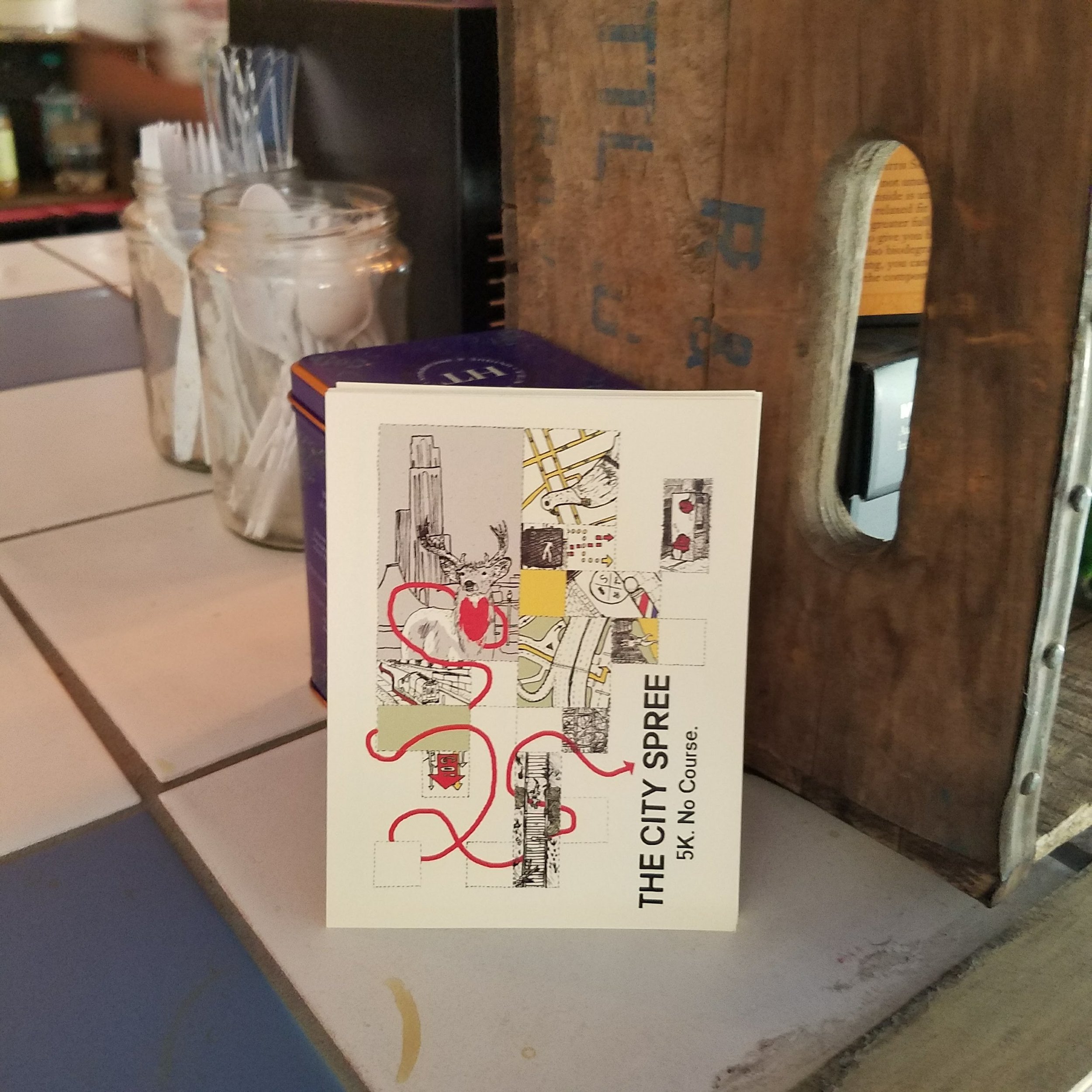
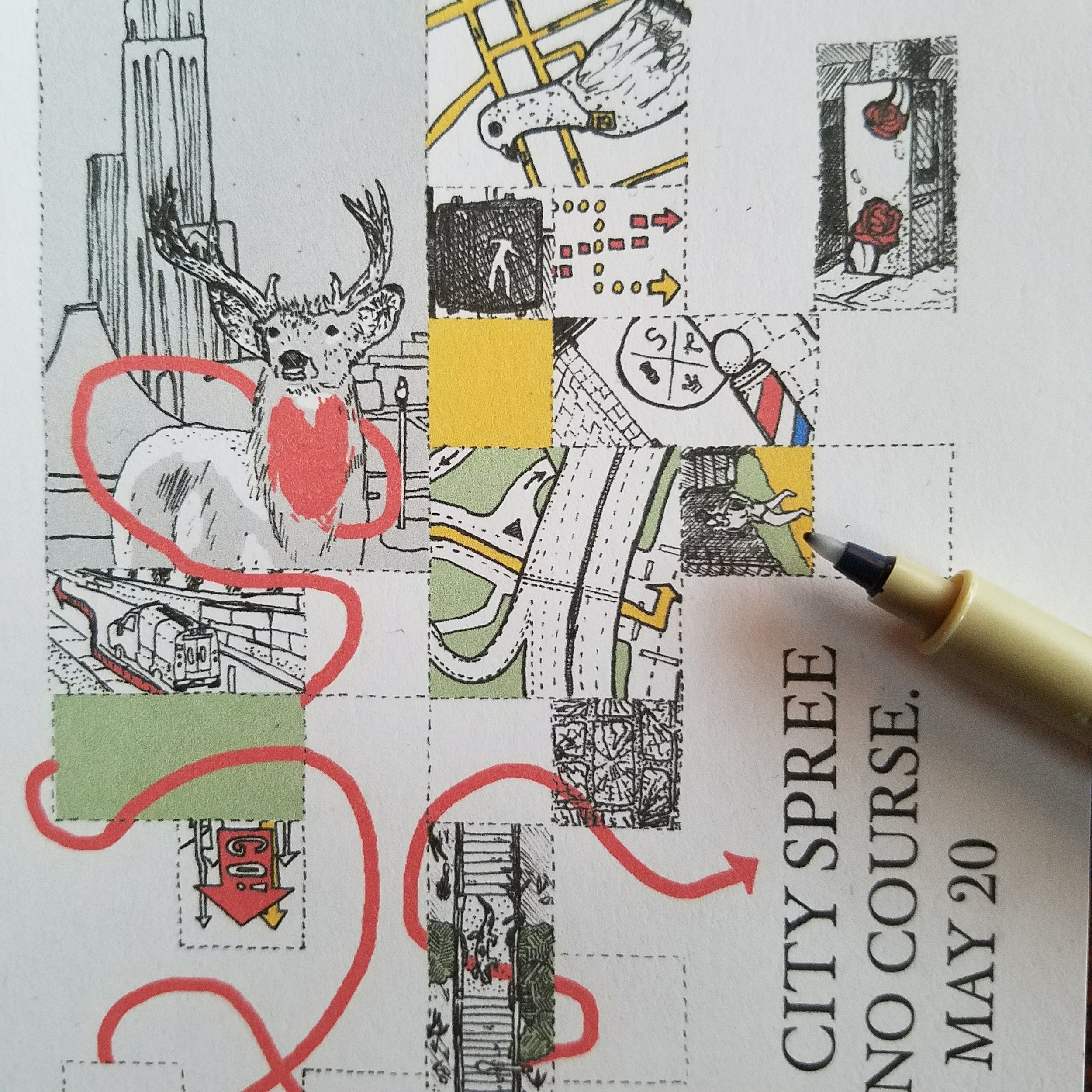
The City Spree is an annual 5K run in Pittsburgh, with the twist of having no formal course. Instead runners start at a central point, and use a map to navigate through the city to waypoints scattered across town.

The Spree is hosted by City of Play, which hosts games, activities, and playful workshops throughout the city. They commissioned me to design flyers and a poster for the City Spree.

The flyer came first - it is a subset of the tiles used in the poster, and served as a "proof of concept" as well.

20180512_123019.jpg

The poster I designed shows the paths of three animals through the city - a deer, a toad, and a rabbit. Their paths are in bright colors, and jump over, under, and around a set of floating tiles, each a vision of one of the waypoints in the race. 

20180517_103829.jpg

Here are some process shots & detail shots.

20180504_114501.jpg
20180514_185150.jpg
20180514_210034.jpg

The Unlandmarks Project

August-December 2017

unlandmarks.jpg

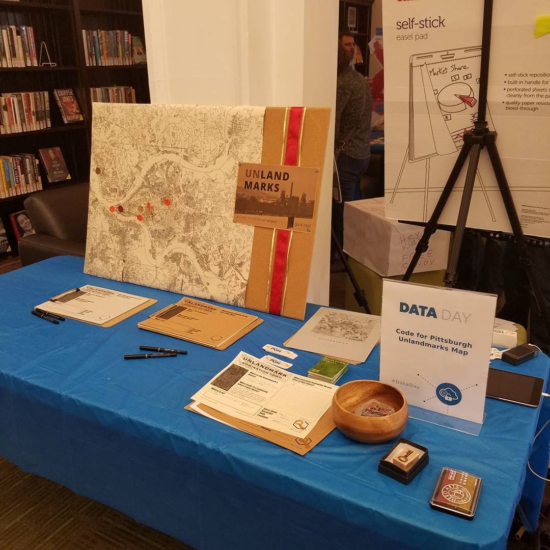
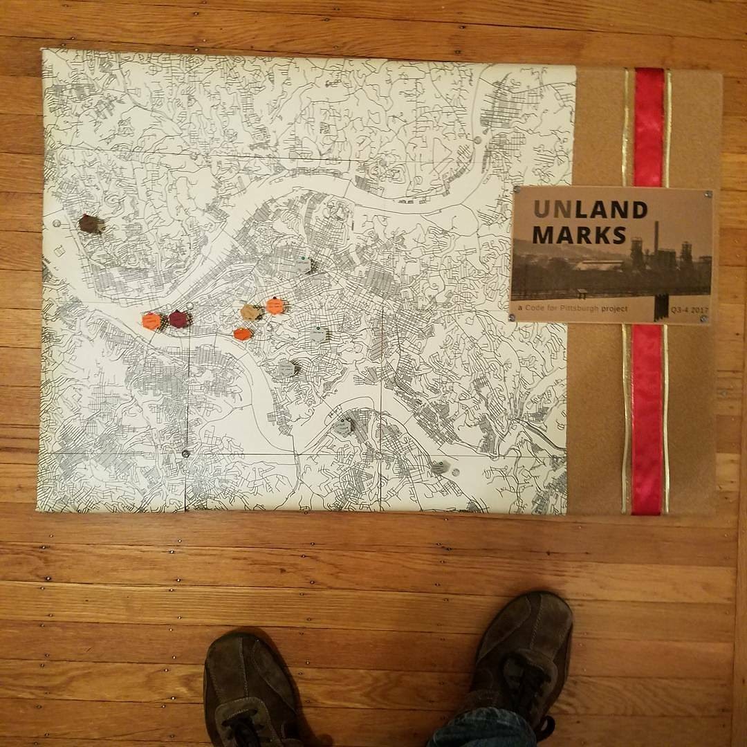
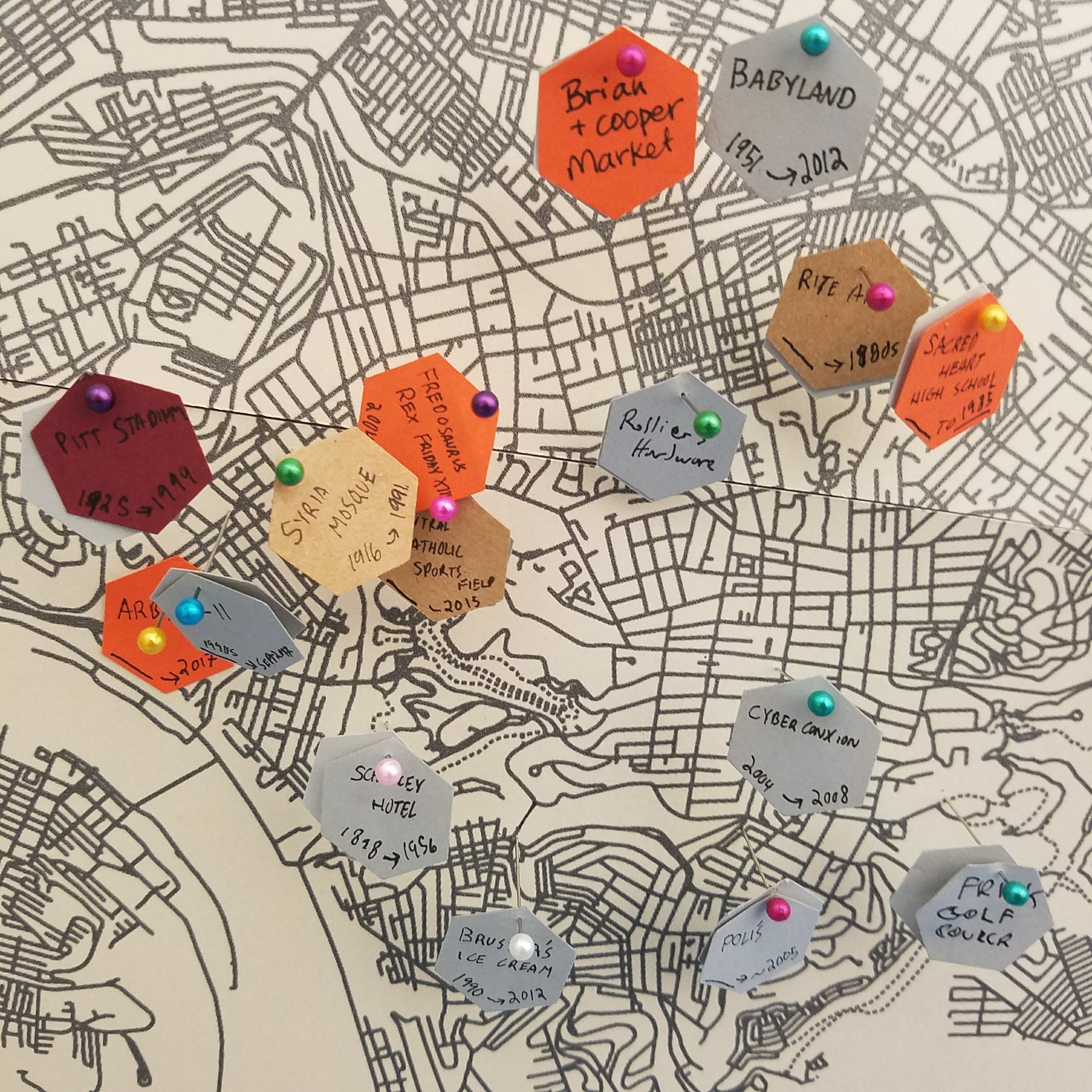
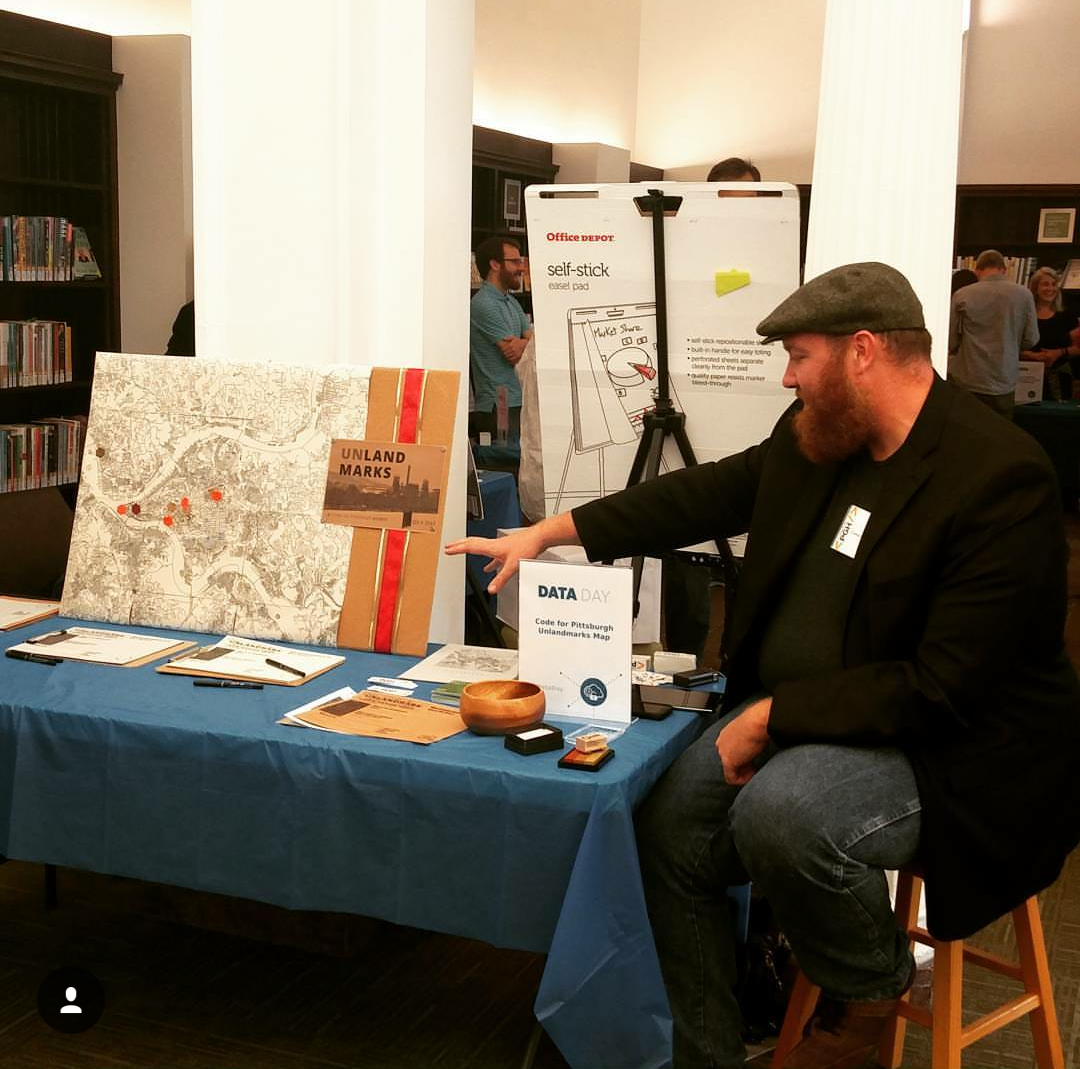
The Unlandmarks Map is a map of landmarks in Pittsburgh which exist only in memory - the actual landmarks are closed, bulldozed, rebuilt, or otherwise gone.

The map was being built by Code for Pittsburgh, during the last half of 2017. Code for Pittsburgh is the region's civic technology meetup group - we gather together as a community to use technology to make the lives of our friends and neighbors better.

We worked on the project for the last half of 2017. The project is on hiatus as of March 2018, but be assured, the work will continue in new forms!


Data Day

CARNEGIE LIBRARY MAIN (OAKLAND), SATURDAY, OCTOBER 21, 2017

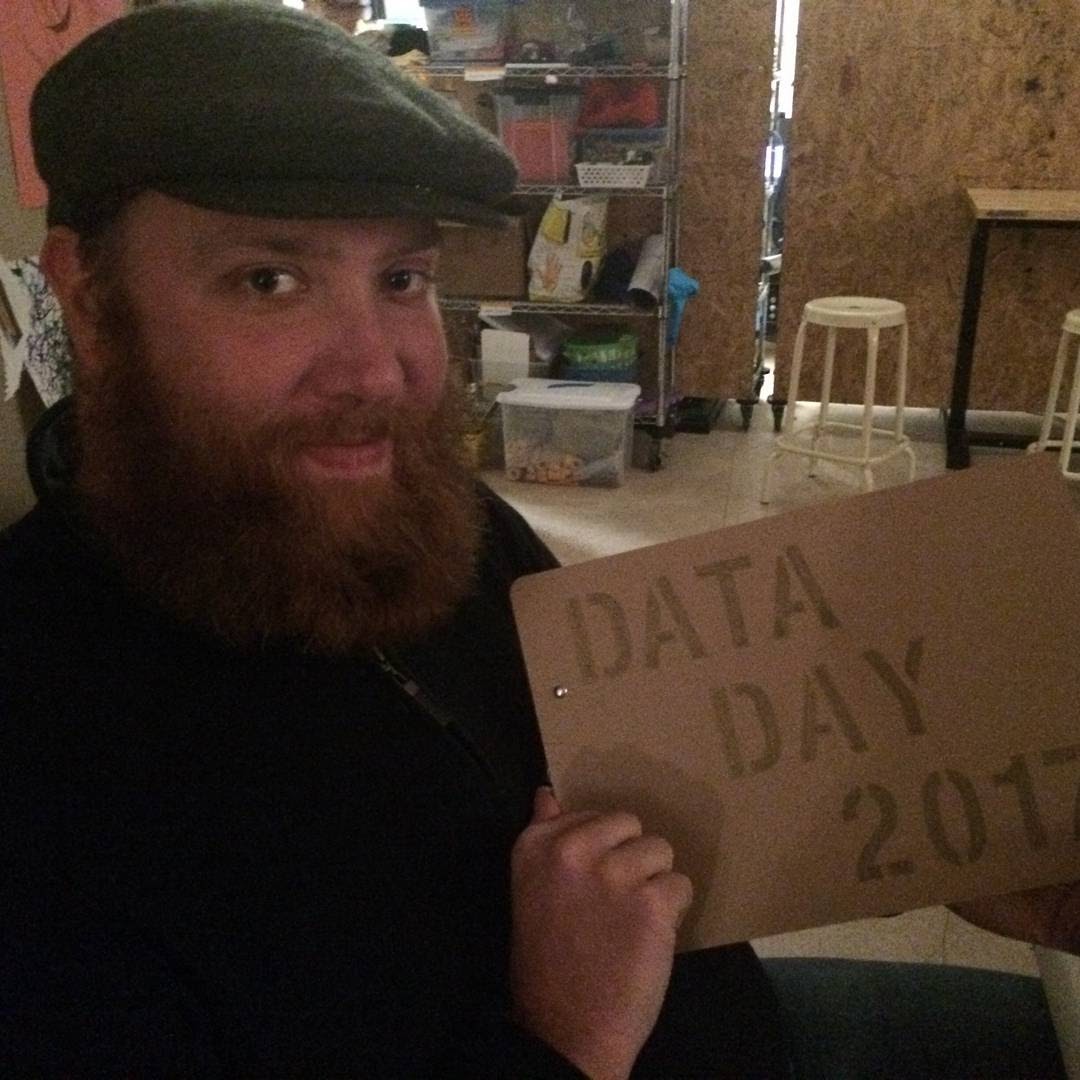
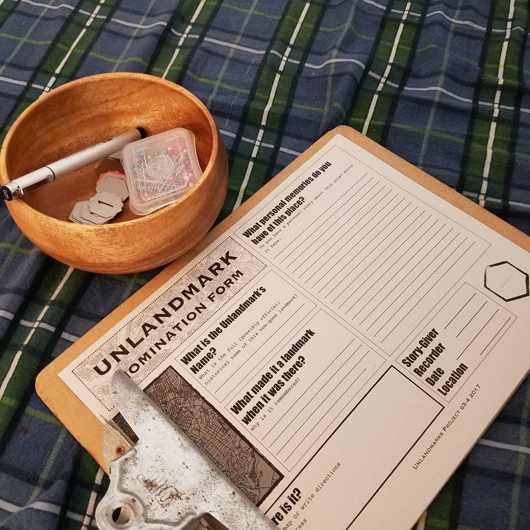
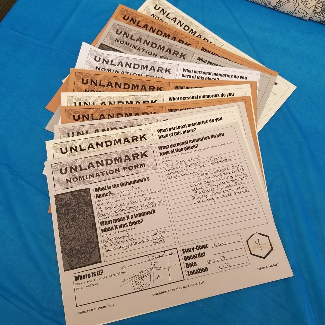
Data Day was a community festival event put on by the Carnegie Library Main. During that day, community members took the time to nominate unlandmarks for the map, and share their personal stories about those now-gone places.

Below are highlight photographs from the day, including the nomination forms, a physical version of the Map, and the community at large!


Community Listening at Creative Nonfiction

November 3, 2017

The next phase of the Unlandmarks project was a community listening session in partnership with the Creative Nonfiction Foundation. This phase consisted of a training evening for volunteers, and then a community listening session at the Creative Nonfiction offices on Friday, November 3, 2017, during the monthly Gallery Crawl that happens in that neighborhood.

The first #unlandmarks map community listening session was last night at @creativenonfiction , during Unblurred, Garfield's art district crawl. Code for Pittsburgh volunteers interviewed 16 neighbors and recorded 40+ memories of things-that-are-gone. 
I was so pleased by the turnout, by the amazing interview volunteers, by the super friendly and fascinating CNF staff, and by the generous neighbors who shared their stories. We heard about childhood haunts, how long-gone bakeries once smelled, the social dynamics at an Insane Clown Posse concert.

Once the interviewers got going, the room was full of neighborly civic energy. Collaboration and celebration of a shared history.

I'm in awe of the connective power of these shared memories of place. By the end of the evening, there were no strangers in the room.
Just neighbors.
Just yinzers.
Just friends.

Gallery Show at Carnegie Library Main

December 2017

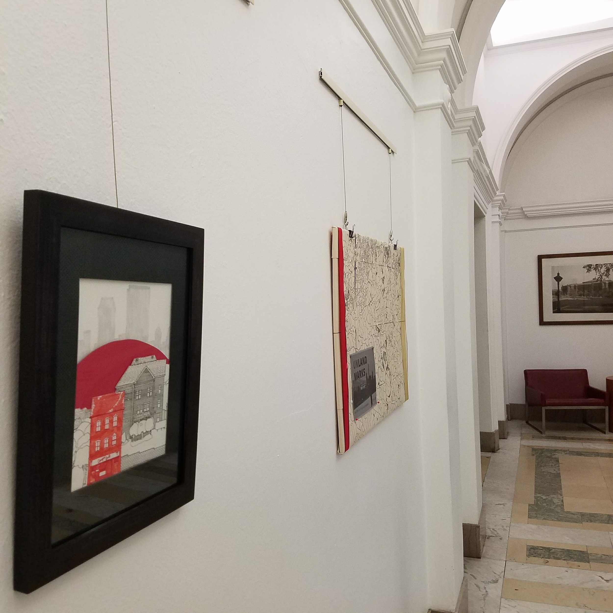
For the month of December 2017, the Carnegie Library Main hosted an art show inspired by the Unlandmarks map, including work by myself and two local artists, as well as historical photographs and reflective essays.

20171201_101241.jpg
20171201_101620.jpg

Fantastic Adventure: Greenfield Bridge

GREENFIELD BRIDGE OPENING, OCTOBER 15, 2017

king of the forest

This one-day event was in concert with the opening of the Greenfield Bridge, the second bridge to bear that nickname. The previous bridge was demolished in December of 2015.

City of Play, a Pittsburgh creative agency dedicated to encouraging creativity and overcoming fear, put on a play/show/adventure/performance/art piece within the larger "The Bridge is Back" celebration, a memory-making, Fantastic Adventure.

The Fantastic Adventure brought together more than 40 local artists to create two sets of locations and events (Wondrous and Wise) to be discovered and interacted with by those members of the public willing to purchase an apple (wrapped in a map!) and adventure! Tokens of Wisdom and Wonder were returned from these sites to maypoles at either end of the bridge, and at sunset, the most-decorated maypole (Wonder!) came alive and marched to the bridge's center, for the ribbon cutting.

For the day, I took on the role of King of the Forest, an ancient, overdressed spirit, picnicking in the city, meeting the public, and welcoming everyone back to Schenley Park.

I made a number of additional materials for the event, including two Appalachian Folk Songs and a tree of Forbidden Knowledge (the Pittsburgh Creed).

Press:

Tribune Review, October 14, 2017 "New bridge restores identity for Pittsburgh's Greenfield neighborhood"

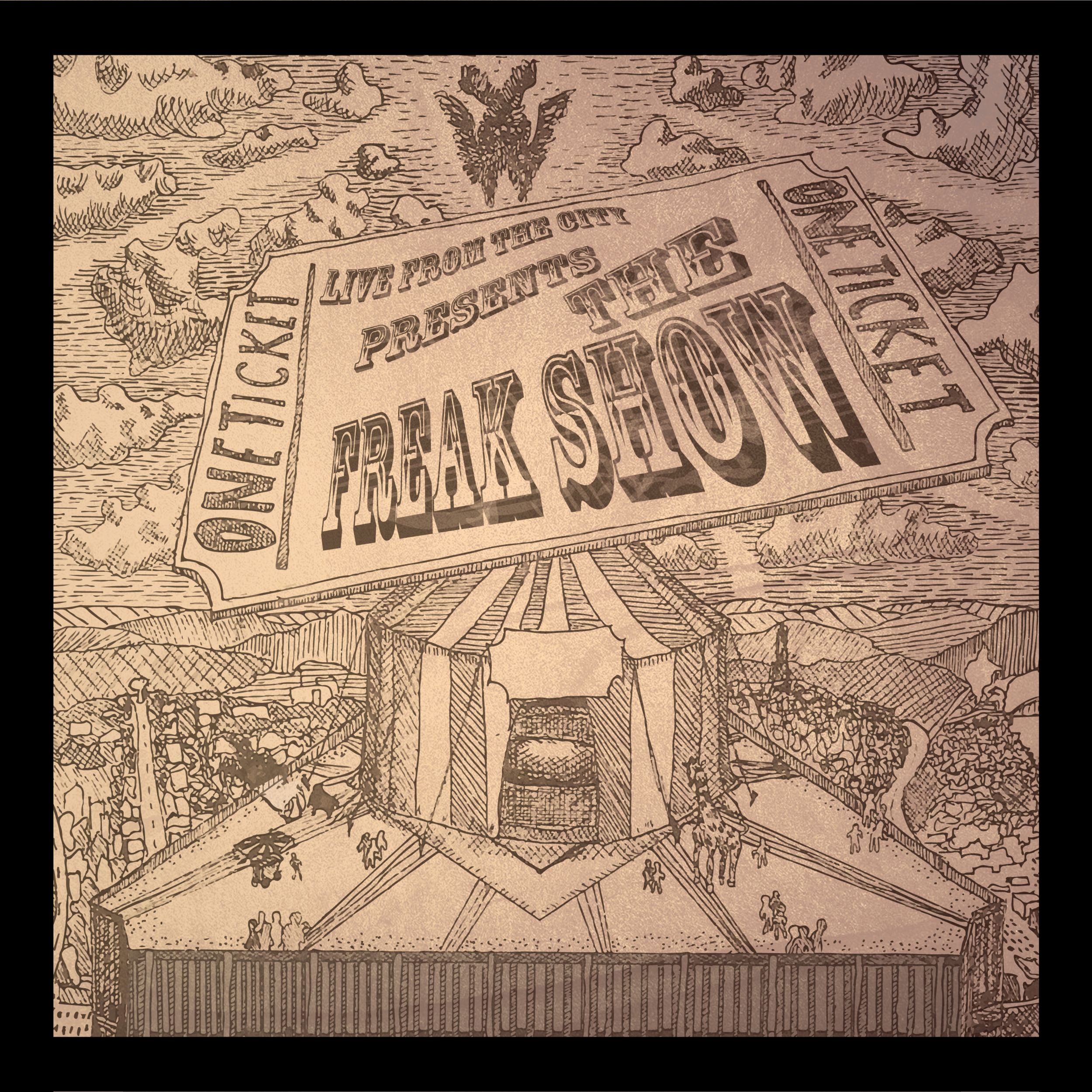
Album Art for "The Freak Show"

The Freak Show Front Cover PNG 2800.png

Pen Illustration with Digital Typography & Design, July 2016.

The debut studio album by livefromthecity. Includes appearances from Tyhir Frost, VO, Jasiri X, Soulja Buck, Jordan Montgomery, Patience Roya'l, and Inky.

The album was released July 15, 2016

The cover depicts a circus tent pitched on the roof of the USX building in downtown Pittsburgh, with the Hill District and Oakland stretching into the back, to Penn Hills and the ridges of the Allegheny Mountains beyond.

An otherworldly seraphim reveals itself in the sky.

Several masonic and thelemic symbols are hidden throughout the piece.

More information about the album can be found here.

On Greebles

June 2015

image.jpg

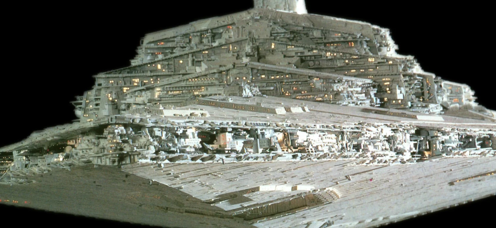
When C-3PO was being shiped through Tunesian customs, the beurocrats got tripped up on a certain entry in the customs manifest - "assorted greebles". The box it refered to was full of miscelaneous costume parts, meant to be affixed to the exterior of the robot. "What's a greeble?" they asked. "Oh, uh, it's something that looks cool, but doesn't actually do anything." 

The term was invented at Industrial Light and Magic for exactly these kinds of non-functional bits - items attached to costumes and shooting models which serve no function but are visually interesting.

image.jpg

​The original Star Destroyer, as seen in the opening scene of A New Hope, was more than eight feet long, and was covered with these greebles. The long, slow pan across the huge ship, with thousands of pipes, wires, portholes, and other visually interesting material, gave the film a sense of scale and wonder. It didn't look like a model of a ship - it looked like a whole ship, and it looked huge.

​The effect was carried off by affixing thousands of spare parts from a dozen different modeling kits to the outside of the ship. Sherman Tank models, Spitfires, and steam-era locamotives were repurposed from thier original design and affixed by the score to the plywood Star Destroyer, until every square inch of the ship had its own unique textured surface.

​There was a term for this already - kitbashing. Model companies might only make kits for certain kinds of planes, trains, and automobiles, but by combining parts from multiple kits, or crafting your own, a kit for one kind of vehicle might be repurposed and built into another kind. ILM replicated this impulse, but on a huge scale, and established an entire new style and understanding of spaceship movies.

​Greebling has continued since, though in modern times it is typically done by computer alogrithm, so that an animator need not hand-place each textural item. 

​What I find interesting about greebling as a practice is that it is about the illusion of scale, the illusion of complexity. The human eye and the human mind can be fooled, and can see paterns where none exist. Later technical manuals and novels within the Star Wars universe codified each piece of the Star Destroyer exterior, assigning meaning and order to each of the model-parts. But when it was being built, no such meaning existed - the modelers just kept gluing on pieces until they arrived at a ship that was visually interesting and showed up well on film.

​They didn't need to write specifications for every subsystem a Star Destroyer might need, or even think about what systems it might embody beyond having engines, lasers, and a bridge. They just had to glue parts on until it looked good.

image.jpg

I've been making role-playing game terrain recently, and have thought a lot about this Greebling. The maps are at a 5ft to 1in scale, which gives cause to have a whole lot of detail. At that resolution, individual leaves are visible on plants, and finger-sized rocks are distinct from one another.

What I'm finding in the drawing of these maps, and thier digital layout, is that the same process that worked for the ILM folks in the early 70s still works - kitbashing. I'll draw a few different kinds of spirals, or tree parts, or ground dirt, and then bash them together and tile them over and over. A few rotations and scalings, and just two or three different varieties of texture can manifest as a robust-looking set of "unique" items. In the above drawing, the spiraling roots of the trees are just two or three different root-spirals, stamped around with varying density and pattern. The ferns at the bottom left are a single image, rotated and layered, with some shadowing applied later. 

It makes the process interesting, since each item I draw is not so much a unique form that will carry through to the final map, but rather an "asset" or individual part, which I might duplicate, manipulate, and use over and over.